Ask Claude Code or Cursor to whip up a landing page and you can probably guess what it’ll look like in three seconds: Inter font, blue button, purple-pink gradient hero, large-radius cards, emoji as icons, a few paragraphs of fake testimonials. It works — but anyone can tell at a glance “this was AI-written.”
ConardLi/web-design-skill is built to fix exactly that. It distills the system prompt of Claude Design (Anthropic’s visual product launched in April 2026) into an open, portable SKILL.md you drop into .claude/skills/ or .agents/skills/. The goal: make agents code with some design taste, instead of producing the same face every time.
This is a walkthrough plus the design philosophies in the skill I think are worth stealing.
The Problem: Generic AI Aesthetics
LLMs have long passed “can it run.” But because their training data overlaps so heavily, outputs converge on the same look. The author lists an “AI-frontend tells” blocklist:
- Purple-pink-blue gradient backgrounds
- Cards with a colored left-border accent
- Inter / Roboto / Arial / system-ui fonts
- Emoji as icon substitutes
- Fabricated stats, fake logo walls, dummy testimonials
None of these are wrong. They’re just too common. Spotting them screams “AI” and dilutes any brand.
Fix 1: Anti-Cliché Blocklist
The skill spells out an explicit blocklist so the agent gets reminded “don’t use these” before generating. This is far more effective than vague instructions like “design tastefully” — LLMs follow negative constraints reasonably well, as long as the items are concrete.
Instead of telling AI to “design beautifully,” tell it specifically “no purple-pink gradients, no Inter, no emoji-as-icons.” The constraint actually opens up the design space.
Fix 2: oklch Color System
The most technical part of the skill. HSL is perceptually uneven — yellow at 50% lightness looks much brighter than blue at 50%, which is why AI-derived HSL palettes often feel “numerically symmetric but visually crooked.”
oklch is a perceptually uniform color space — same L value actually looks the same brightness to the human eye. The skill mandates oklch for color tokens:
| |
The side benefit is clean ramp derivation — lock chroma and hue, vary lightness, and you get a visually consistent gray or accent scale.
Fix 3: Declare the Design System Up Front
This is the heart of the skill, in my view. The biggest problem with AI-written frontend is “decide as you go”: pick a color when you reach the hero, swap fonts when you hit the footer, and end up with a page stitched from mismatched parts.
The skill forces the agent to declare design tokens in markdown before writing any code:
| |
Only then does coding start. This separates “design decisions” from “implementation” — the user can correct direction at the token level, instead of waiting for a full page to discover the overall tone is off.
Fix 4: Show a v0 Draft First
Don’t deliver in one shot. The skill requires a “v0” pass: layout skeleton + design tokens + placeholders, so the user can confirm direction before details get filled in.
This mirrors the human wireframe → high-fi mockup workflow. AI normally skips it because it wants to deliver a complete artifact in one go — but a complete artifact is expensive to revise. A half-built one is cheap.
Fix 5: Placeholder Philosophy
One of AI’s dumbest habits: when an image is missing, it draws a wonky SVG and pretends it’s an illustration. The skill bans this and uses honest markers instead:
| |
The reason is simple: bad SVGs mislead the user into thinking they’re finished assets, while text placeholders clearly signal “real asset needed here.”
The Six-Step Workflow
The skill structures the entire process:
- Understand requirements — only ask if information is insufficient
- Gather design context — code > screenshots, never start from nothing
- Declare the design system — tokens in markdown, as above
- Show v0 draft — layout + placeholders
- Full build — components, states, motion; pause at decision points
- Verify — pre-delivery checklist: no console errors, no rogue hues
This structure suppresses the LLM’s urge to “give a complete answer in one shot” and forces it into an iterative workflow.
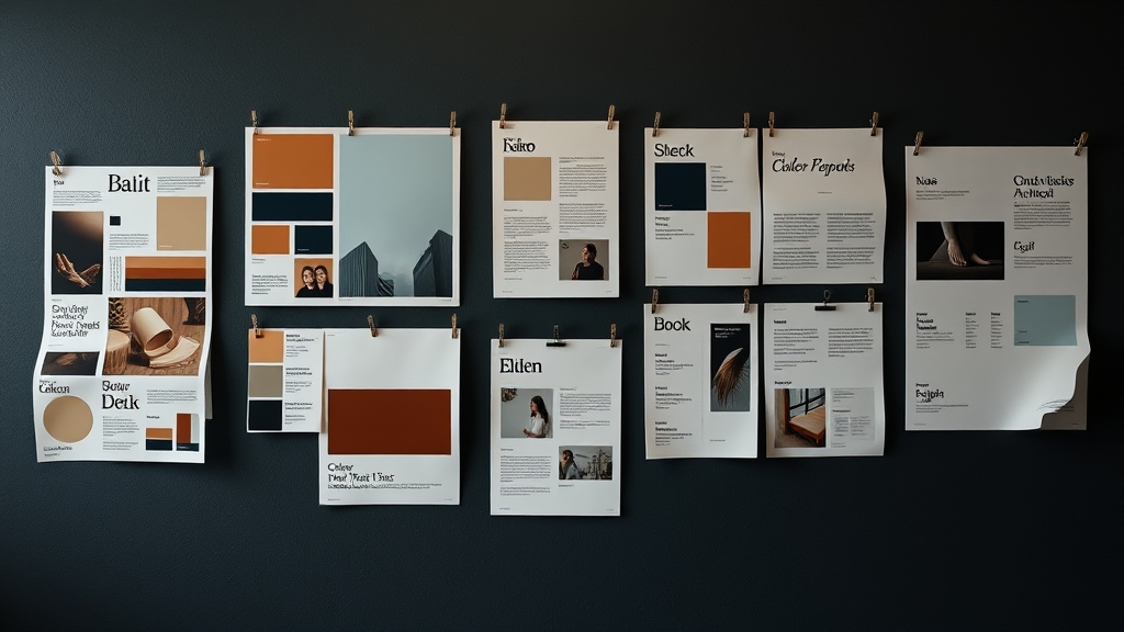
Six Color × Font Pairings
The most practical cheatsheet in the skill. Six pre-validated combinations the agent can grab when stuck:
| Style | Color | Fonts | Use Case |
|---|---|---|---|
| Modern tech | Blue-violet | Space Grotesk + Inter | SaaS, dev tools |
| Elegant editorial | Warm brown | Newsreader + Outfit | Content, blogs |
| Premium brand | Near-black | Sora + Plus Jakarta Sans | Luxury, finance |
| Lively consumer | Coral | Plus Jakarta Sans + Outfit | E-commerce, social |
| Minimal professional | Teal-blue | Outfit + Space Grotesk | Dashboards, B2B |
| Artisan warmth | Caramel | Caveat + Newsreader | Food, education |
Notice Inter only appears as a secondary font in “modern tech” — not the default. That’s the anti-cliché rule in concrete form.
How to Use It
Clone, copy .agents/skills/web-design-engineer/ into your project (.claude/skills/ for Claude Code), and the agent picks it up automatically on frontend tasks.
| |
The repo’s demo/ folder has same-prompt comparisons with and without the skill. The gap is obvious — worth opening directly.
Why It’s Worth Following
The real value isn’t “a design checklist for AI” — it’s a methodology for externalizing design decisions. Writing tokens as markdown, anti-patterns as a blocklist, the workflow as six steps — these all turn vague “taste” into structure an LLM can read.
The same idea applies anywhere: if you want AI to have taste in a domain, list “do” and “don’t” explicitly. Far more effective than a thousand-word system prompt.
Other Claude Code skill-related reading: claude-view: Mission Control for Claude Code — a dashboard for monitoring sessions, cost, and token usage.